Almost everyone, who uses a smartphone, is familiar with the bright, pink-yellow-and-orange concentric curved squares in the Instagram logo. But the 4th largest social media network in the world with 2 billion MAUs (Monthly Active Users) wasn’t launched with this bright, colorful logo. It had a rather bland logo that resembled a polaroid camera. The current ig logo has been in use only for a little more than two years now.
Let’s learn more about the evolution of the Instagram logo – From classic to contemporary; polaroid to the bright and rounded square that we see today.
Instagram Logo – Short History
15 years back, Kevin Systrom and Mike Krieger (the original founders of Instagram) noticed a constant surge in mobile photographs and decided to create a platform where people can upload their special moments regularly. Hence the first-ever ig logo resembled the frontal view of a polaroid camera, which is known to capture and publish shots instantly (hence the name, Instagram).
Shortly after, Mark Zuckerberg acquired the app for $1 billion in 2012. Today, it’s the 3rd most-used social media apps that entertains content creators and viewers alike. And it’s not only about pictures any more. No wonder its polaroid logo went through several modifications to cater to the changing dynamics of the social media platform!
However, there’s something interesting to note here. In the first ig logo, there was something that continued to be a key aspect of its future logos.
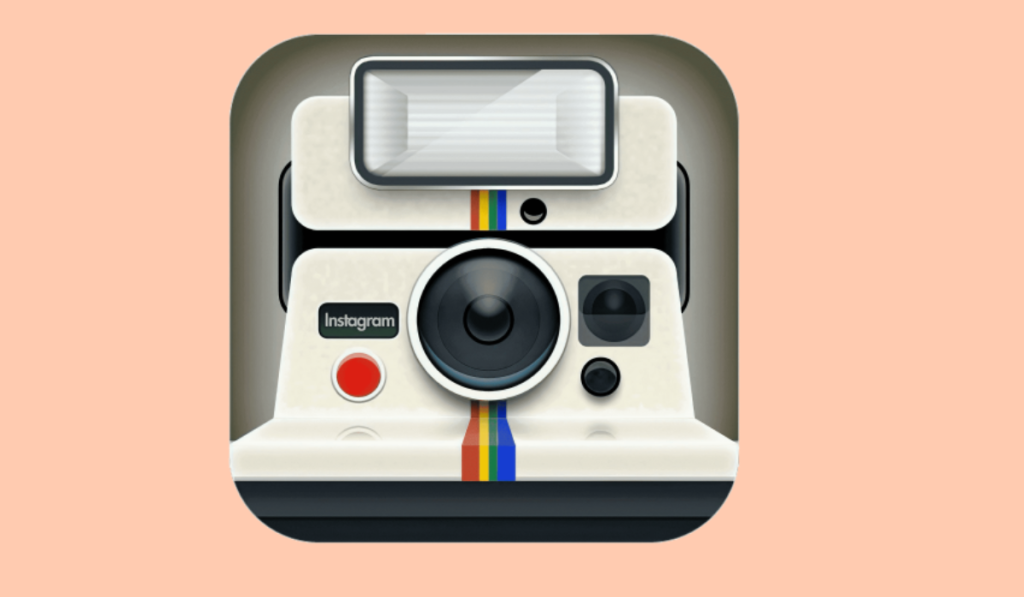
Check the logo carefully. You’ll notice a thin rainbow band that ran vertically across the logo. This rainbow band was retained in the ig logos that came after. Also, the rounded square shape of the logo remained unchanged.
Evolution of the Instagram Logo
The Instagram logo that we see today is a result of several design changes that happened over time. An emblem logo, it has evolved from a classy, vintage appearance into a professional icon, which is recognized globally. Scroll on!
The first Instagram logo for iOS devices (2010)
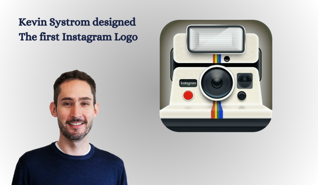
The first-ever logo for the photo-sharing app was designed by none other than its founder, Kevin Systrom. It was short-lived and released only for iOS users. This logo had a complete vintage appeal with its classic polaroid camera symbol. The brand name “Instagram” was printed on the left of the camera body in tiny font size. The silvery-gray color of the camera in the logo looked quite realistic, catering to the purpose of the app, i.e., sharing photos instantly.
This ig logo was not an official one and was removed within a few months.
First Official Instagram Logo (2010-2011)
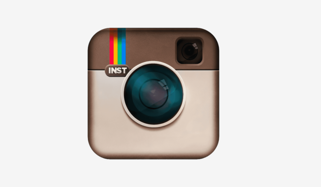
It was the time to design an official logo for the brand, and Kevin Systrom hired Cole Rise, a professional photographer and graphic designer, for the job. Rise retained the original vintage theme, only changing the color palette to beige and brown. The camera in the logo was somewhat inspired by the Bell & Howell camera model of the 50s.
The new ig logo was more intensified and had fewer details compared to the previous design. It looked de-cluttered and thus was more memorable. The rainbow band found its way back into the new logo, positioned at the upper left side of the camera. It also had the words “INST” (short for Instagram) in Sans Serif font engraved below.
Instagram Logo (2011 – 2016)
The new logo of Instagram looked more vivid and captivating than its predecessors. A leather patch was added at the top of the emblem to intensify the vintage appeal of the camera. The lens was made more glossy, thus looking more realistic and natural. Also, the camera body gradients were made more contrasting. The rainbow band retained its position at the upper right corner, but the letters beneath were tweaked a little. The Sans-Serif “INSTA” became a Bold-Serif “Insta” and was more visible. Overall, this new Instagram logo was, by-far, the best design that the app had.
Rounded Square Instagram Logo (2016-2022)
The iconic rounded square gradient logo of Instagram was released in 2016. It completely replaced the vintage camera symbol, only retaining the theme. One of the reasons for this complete revamp was the evolution of the app itself. Instagram was no longer only a photo sharing app. It encompassed several other properties of a quintessential social media platform, like direct messaging, sharing videos and other types of content. As the result, the old logo was no longer suitable for this new-age social media app.
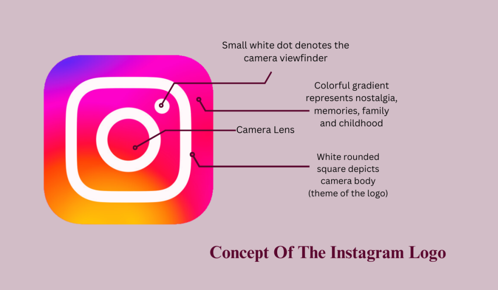
The designers replaced the vivid camera symbol with a rounded square. The rainbow band was transformed into a bright gradient using the base colors, blue, orange, and pink, that completely filled up the logo space. The polaroid shutter was depicted by a bold-white rounded square. A white dot at the upper right corner of the square represented the front camera lens. All typography was dropped from the image, keeping it simple and minimal.
There was a mixed response to this new logo, as many people found it quite abstract, varying widely from its previous vintage appeal. However, this ig logo perfectly represented the age of Smartphone photography, an ever-increasing trend. On a different note, it added some drama to the brand’s story, making it more appealing to the audience.
Brightened IG Logo (2022-Present)
In this version of the Instagram logo, the designers retained the 2016 design, only brightening it up a little. The concept, theme and shapes remained unchanged. The color palette was tweaked a bit from orange to purple, and the gradient was made a few shades lighter. Hence, the logo appeared brighter than its previous version. The contoured square with the circular shutter at the center – everything remained the same. Even the white dot at the upper-right corner wasn’t touched by the designer.
The vibrancy of the new Instagram logo is simply unmatched. It offers an inclusive experience to all the users, from creators and communities to viewers. As Cynthia Pratomo, the Creative Director at Instagram aptly says,
“The world is so familiar with the Instagram brand that making any type of change is challenging. We want our system to be true to the spirit of Instagram – not simply change for the sake of change. That’s why the simplicity of the design system refers to what we all love most about using Instagram – it’s always content and community-first.”
The Black-and-White Instagram Logo (2016)
You may have come across a black-and-white Instagram logo while using the app. So when did THAT logo happen and why?
In 2016, when the logo was revamped, the designers also created a black-and-white logo flat-design logo for in-app users. It featured the original contours in white on a black background. This monochromatic Instagram logo is simple and easy-to-the-eye, constituting a better user interface. A new version of the monochromatic logo was created in 2020, that reversed the color theme,i.e., black contours on a white background.
The Instagram Logotype and Its Evolution
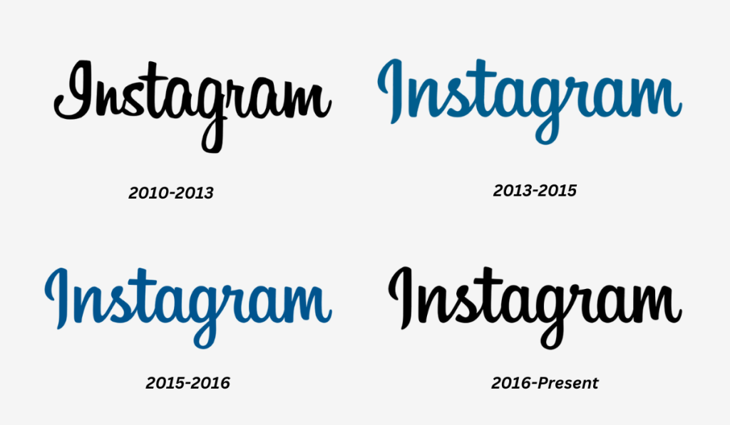
The original Ig logo wordmark was in black and carefully written in cursive, handwritten fonts. The fancy, elongated lines of some of the letters perfectly were balanced with the short, bold strokes of the others.
In 2013, this wordmark was redesigned by changing the color palette to a calmer shade of blue. The typeface was also modified by straightening up the letters a bit. This gave the logotype a fresh and more professional appearance.
In 2015, the design was again tweaked to a appear bolder and more intensified. The typeface remained untouched, but the color became darker and deeper, depicting a sense of royalty.
The current logotype of the Instagram logo, which was redesigned in 2016, returns to its original color palette, i.e. black. It’s logical, considering the bright and colorful gradient of the emblem, which appears in sync with the black typeface. However, the lettering remained the same.
Features of the Instagram Logo and Their Relevance
The Instagram logo is highly feature-rich with its color themes, patterns and design elements each having a role to play in the brand’s visual identity. Over time, several things have changed in the logo, keeping the theme intact. However, there was a concrete reason behind each change in feature.
| Font | Color Palette | Design Elements |
| The Instagram logotype is a customized cursive typeface in black. The wordmark on the original logo was a specially-designed Instagram Sans developed by the brand in collaboration with Colophon Foundry in the UK. The reasons to choose a custom typeface is legitimacy and versatility, not to forget, uniqueness. | The vintage rainbow band associated with the original IG logo was revamped into a gradient theme in 2016. The colors used in the theme were sand-yellow, orange, bright pink, purple and blue. The reason to switch to a gradient color palette was primarily adding some warmth and energy to the rainbow theme. Also, the gradient looked more professional. | The emblem of the Instagram logo is a polaroid camera. In the original design, it was more realistic with the top-half covered by a leather patch, and a glossy camera lens in the middle. In the 2016 version, however, the vintage camera was transformed into an abstract imitation in bold, white contours against the colorful gradient backdrop. The reason for this change is creating a multidimensional logo that catered to the ever-changing dynamics of the photo-sharing app. |
Concept of the IG Logo
The primary concept of the Instagram logo is instant photo-capturing, represented by the polaroid camera that flaunted this quality in the 80s. It also inspires nostalgia of the 70s and 80s, making every beautiful memory count.
Instagram Logo Rebranding and Its Impact
In the Spring of 2016, Instagram released its new logo, replacing the vintage polaroid camera that people were so fond of. And the criticism was huge. Many users took to their social media handles to express displeasure and disappointment over this move.
But the brand took it all positively and sportingly, as their reasons were clear. Ian Spalter, the Head of Design in the company engaged released an article, explaining why the rebranding was necessary. It helped control the outburst to a great extent, as people understood the logic behind creating the gradient Instagram logo.
All these discussions regarding the new Ig logo created a buzz on social media, which ultimately helped the brand.
PR articles that justified the move were contradicted by users, and vice-versa. In all this hullabaloo, Instagram got what any brand would love to achieve – Taking the social media by storm.
In the advent of this chaos, Mashable published an article, where the designer of the former logo, Cole Rise was quoted saying,
“I’m super psyched on the new one. I love the minimalism. Regardless of the colors behind it, the white shape — the actual bones of the new symbol itself — is beautiful, and I think that can persist over time.”
Lesser-Known Facts about the Instagram Logo
- Visual Saliency – A visually-salient design is noticed faster and remembered longer. The new Instagram logo has thick, white lines against a bright and colorful gradient background. This contrasting quality increases its visual saliency, making it more noticeable.
- Rainbow Colors – The rainbow colors used in the original Instagram logo stood for newness, freshness, joy, hope, promises and fun. In the latter version, the colors were merged into a gradient that depicted a sense of warmth and intensity.
- Nostalgic Theme – The theme of the Instagram logo has always been based on vintage nostalgia, represented by the polaroid camera symbol. It also stood for family, childhood memories, and every special moment that we used to capture with the polaroid cameras to get instant prints.
- Propositional Density – Images with little details but conveying a deeper meaning through simple elements are said to have high propositional density. The Instagram logo is one such image that intrigues the mind without being hard on the eye.
- Curved contours – According to design experts, people prefer curves over angular edges. It’s one of the biggest reasons why the Ig logo has always been curved at the edges. Even the revamped version of the logo retained this property.
Over to You
The Instagram logo is as popular as the social media platform itself. The original logo with its vintage camera emblem was much-loved by the users. It depicted a sense of nostalgia and familiarity. When the company revamped the design in 2016, there was a lot of disappointment expressed on social media. The new design was flat and minimal, a major shift from its original polaroid version. However, the company left no stone unturned to explain the reasons behind the rebrand to its audience, ultimately reducing the negative outburst.
Today, we enjoy the new Instagram logo as much as the app. It’s a core aspect of the brand’s identity, undoubtedly. The rebrand was necessary to stay on par with the ever-changing digital landscape. The theme is still about nostalgia and capturing special memories, though the content type may have expanded. The logo is completely in sync with the theme of the social media app, only more advanced and evolved.
