Eight seconds – that is the average attention span of a person today. Considering how ad designs are mostly visual, that seems enough, doesn’t it?
But the average person is also exposed to roughly 5000 ads a day. This means that there are thousands of ad designs on billboards, newspapers, Instagram, Facebook and YouTube that they simply scroll past. And that’s not something you want happening to your business ads!
So, do we need yet another ad design after this?
Short answer – yes. In the age of digital marketing, ads have become veritable sources of revenue and lead generation. Software like Mailchimp and Upfluence has made it easier to track potential users and their habits.
But how do you make sure your ad reaches the right person?
The obvious answer is hiring a graphic designer and a marketing expert. But for smaller agencies, hiring or even outsourcing to a designer may be a stretch on their expenses.
Fret not! With a steady internet connection and a few simple tutorials – you can create amazing business ad designs yourself with ad makers! Every workman needs his tools – so let’s get started on the what, where and how of digital ad design.
How The Right Ad Design Can Help Your Business Grow
There are many businesses like Airbnb that do not own any physical assets. Rather, their entire presence is online. And yet, they have emerged as a leader in their field.
How did a company create a following without a physical presence?
For one, there is the matter of digital branding. To review any company today, people often refer to their social media pages. Hence, a Facebook, Instagram, LinkedIn, Pinterest, YouTube or Vimeo page is absolutely mandatory.
And the right ads displayed here can draw in people. After all, every ad a customer sees as they browse through a site is based on their previous preferences. So, even if they leave your social media page, if they showed an adequate interest in it – they will continue seeing your sponsored ads on other sites!
But, what is the right ad?
Thanks to cookies and customized ads, customers are now used to seeing everything curated as per their taste. Thus, any company that does not take advantage of digital marketing is left behind. You have to provide your customers with what they want to see, instead of imposing your view on them. This is the main area where digital ads differ from old newspaper ads – the variety and choice!
The right ad design for your business must contain a few things:
- A novel idea appealing to a certain section of the customers
- A well-written concept that is easy to read and understand
- A call-to-action button for a product – it’s how we drive sales
- An exit strategy to make users feel safe should they choose to opt-out of the commitment
- The illusion of choice!
- A share button to allow social networking
- A thank you page linked after the purchase of the product
The success of an ad design is judged by its results. New users may often need to experiment with various styles before they settle on the “company style”. Here are the results a good ad should bring your company:
- Larger number of visitors to your landing pages
- A higher conversion from surfers or visitors to subscribers
- A longer email list
- An increase in overall brand value and recognition
- More sales, of course!
A simple way of keeping track of your ad performance is Google Ads. With Google Ads, you can set target keywords, keep track of your company’s performance, see visitor clicks and display ads across a variety of Google ad-sense approved platforms.
To find the right keywords, you can invest in software like Ahrefs, Ubersuggest, Keyword Surfer, Semrush and more. However, that’s a topic for some other time. Let’s get into the ad creator or ad maker that can help you create stunning ad designs.
Free Ad Makers for Your Business Ad Design
To design an ad, you need a creative graphic design tool. Professional graphic designers may use high-end software like Adobe Illustrator or Adobe Photoshop that allow unlimited possibilities. However, for beginners, there are various free ad maker that are just as good!
With all of these, you can choose to upgrade to a paid plan anytime to reap more benefits and access a larger template and image library.
1. For The Explorers: Canva
There is no doubt that Canva has emerged as a leading contender for aspiring and new graphic designers. And it is interesting to note that they themselves effectively used targeted ads for this.
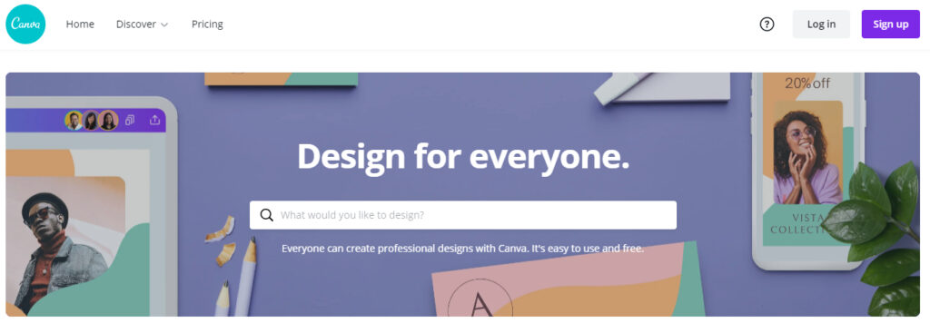
With Canva, you can create almost any type of static or dynamic ad design. They offer thousands of templates and even an open editor. You can drag-and-drop elements from their elements library. This means you can add pictures, text, banners, etc. wherever you want. You can also set your brand colors to make sure all your ads follow a given color scheme.
You can easily collaborate by sharing a link (similar to Google Docs) and access a huge library of free stock images. Canva offers the best free version tool there is. You can also choose templates from a predefined set – like LinkedIn banner ad design, Facebook banner ad design etc.
Pros
- Huge template library
- Preset banner sizes
- Drag-and-drop editor
- Team collaboration
- Can edit banners, photos, videos
- Stock images library
Cons
- A slow-loading interface
2. For Team Efforts: Creatopy
Creatopy is an easy and beginner-friendly graphic design tool. They offer multiple branding kits or templates that you can choose from. Using these templates, you can easily create an ad by replacing the existing elements or adding a new one. The interface is as easy as using Microsoft PowerPoint.
Creatopy understands that every business prioritises its “brand image” above all this. This is why you can create your logo, set your brand font and colours and use them across all templates.
If you are working as a team, you can opt for their Multi-channel content creation and work together within the same workspace. Creatopy allows you to access an unlimited stock images library as well. With the paid plan, you can remove the Creatopy watermark and also access their ad analytics feature.
Pros
- Branding layout
- Easy and intuitive UI
- Team collaboration
- 10 different colour palettes
- Can save in any format
- Ads analytics and reports
- Stock images library
Cons
- Small template library
- Upgrading is expensive
3. For Complete Beginners: Snappa
Snappa claims that they can help you create a banner ad design in under 60 seconds. Creatopy claimed you can do it in under 5 minutes. Between the two of them, Snappa certainly wins. It is the perfect tool for absolute beginners who do not have any experience in the ad design field.
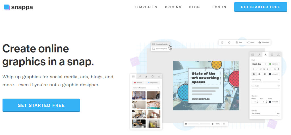
Unlike Canva and Creatopy, Snappa breaks down the drag-and-drop editor into grids. You can edit anything or add any elements within these grids. While professional designers might find this restricting, it is perfect for new designers who have their work cut out for them. Snappa offers over 5,000 templates (free plan) and team collaboration.
They have pre-set sizes for Twitter, Facebook ad LinkedIn banner ad designs. Apart from this, you can also crop, rotate and edit general photos, use it to create Instagram stories and so on. Snappa cannot be used to edit videos. In the paid plans, an interesting feature is the “remove the image from the background” feature that you can use to clean up the text. This feature is usually not seen in such beginner tools.
Pros
- Extremely beginner-friendly
- Huge template library
- Stock images library
- Preset banner sizes
- Grid-based layout style
- Team collaboration
- Clean Image option
Cons
- The free plan allows only 3 downloads a month
4. For Amazing Photos: BeFunky
BeFunky has three modes. It allows you to edit photos, create collages or design banner ads. With their Graphic Designer tool, you can select from templates and build an ad by dragging and dropping elements into the workspace. It also allows you to create email templates, Etsy banners, Shopify banners and more.
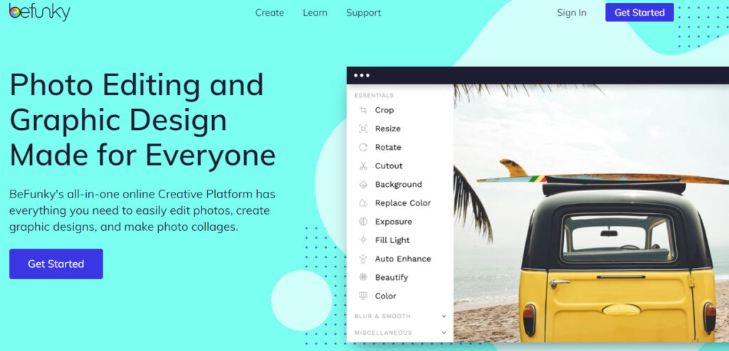
The photo editor is incorporated in the Graphic Designer tool. So you can easily edit any image without referring to a second tool. With the Batch Processing option, you can apply the same style or filter to hundreds of images at once!
You can also access stickers from their library or create your own to add to Instagram stories. And the best part is, you do not need to register to try out their editor! You only need to do it before downloading it.
Pros
- Stock image library
- Batch photo processing
- No sign-up needed to edit
- Most affordable plan on the list
- Stickers library
- Photo enhancer and retoucher
Cons
- Does not support collaboration
- No brand style feature
5. For Animated Ads: Venngage
For those willing to experiment with animations and dynamic ads, Venngage is a great option. Venngage covers 40,000 icons, thousands of templates, font options and banner styles. You can also choose to share your completed banner directly on social media or download it in any format from JPEG to PDF.
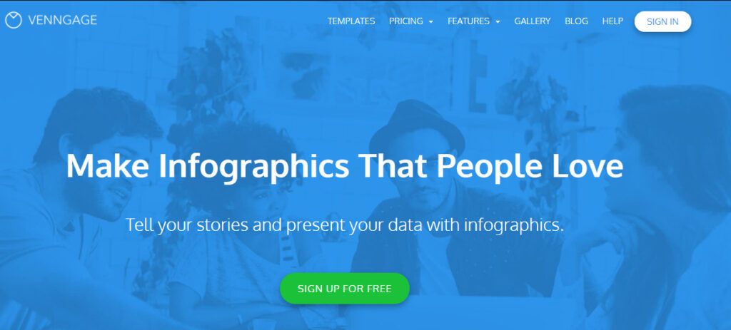
Venngage was not only designed for banner ad designs. You can use it to create infographics eBook and eBook covers, brochures, whitepapers, and more. For companies, the Venngage workspace can be used to detail out sales processes, work funnels and mind maps.
With the team collaboration option, you can use Venngage both to design ads and plan strategies! You can also convert any ad to your “brand style” by saving your brand data and applying it in one click.
Pros
- One-click brand style application
- Team collaboration
- Supports videos, brochures, infographics
- Can be used for mind maps and strategy planning
- Huge stock library access
- Infographics library access
- Can save in any format (even in free plan)
Cons
- The free plan allows only 5 infographics a month
- A bit expensive than other plans if upgrading
6. For Non-Designers: Colorcinch
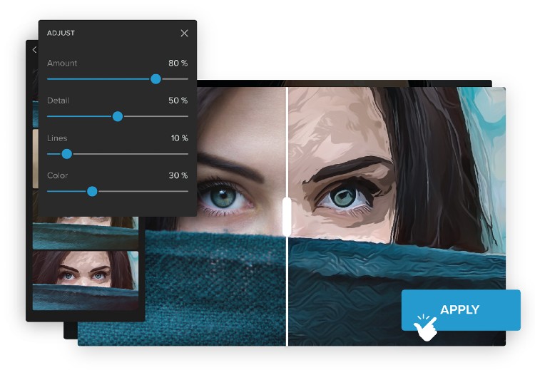
Colorcinch is a photo editing & graphic design tool that lets anyone become a professional designer in an instant! It comes with a clean and intuitive interface so you can create eye-catching ad designs and visuals on the fly. You can play around with hundreds of amazing filters & effects (paintings, sketches, cartoonizer and more) and make your colors pop, transform with blend modes, and fine tune photo details. You can customize your photos by adding texts, vector icons, masks, and overlays and organize multiple elements with its layers panel. You can choose from its collection of stock photos or upload from your device to start designing.
Pros
- Clean, intuitive UI
- Essential editing (crop, resize, rotate, detail…)
- Hundreds of special artistic effects powered by AI (turn any photo into painting, sketch, cartoon)
- A premium collection of stock photos and vector graphics
- A vast library of filters and presets, templated masks, overlays and frames
- Layering, blending and masking controls
- No sign up is required for the free account
Cons
- Features & effects may be limited for non-premium users
7. For Businesses of all Sizes – Desygner
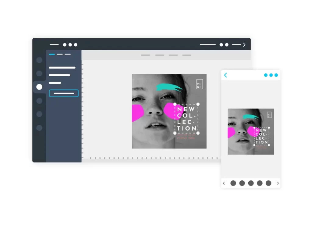
Desygner is a graphic design tool for non-designers focused on ad creation for everyone. You can create stunning designs such as social media posts, ads, presentations, infographic, business cards, flyers, and more. You can get unlimited access to millions of free images, thousands of fonts and pre-made banner ads that you can use however you want. With a PRO plan, you can also get immediate access up to 147 million Shutterstock images to use as much as you need. Desygner have pre-loaded all the correct sizes for social media, display advertising and print so that you can repurpose your ad design quickly and easily. Desygner is used by marketing teams, entrepreneurs, and independent professionals to execute ads faster!
Pros
- Drag & drop elements
- Change images, fonts, colors & text
- Work with layers, effects & multi-page files
- Thousands of professionally-designed templates
- 100% royalty-free resources
- Share and print your work instantly
- Resize in seconds
- Import & edit PDF files
- Brand Asset Management, Branded Templates, Brand Guidelines & Restrictions
- No watermarks or download limitations
- Background removal
Cons
- Features, collaboration & access to Shutterstock images are limited for non-premium users
General Tips to Create Catchy Ad Designs
Let’s take a look at the general tips all graphic designers abide by. And also some examples for the same!
Strong Headline – Less Strong Subtext
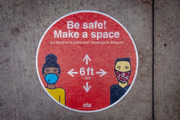
Graphic designers often use the power of textual hierarchy to showcase the relevant parts. Create a strong headline, keep it short and make it big. You can now add the explanation below in a smaller text. Having a strong headline grabs the users attention. But too many words can confound them.
See how in the banner ad design below, the main text is larger, bolder and stronger. It immediately draws the user’s attention to what’s important.
Call-to-action Button
If your ad designs appeals to someone, it is necessary that they must know what to do next. So every ad must have a prominent call-to-action button. This can be a button promising users more information, free goodies, take them to a sign-up page or lead them to your social media page.
Either way, you have to define a path for your user to follow. And you can also use the clicks on this button to determine the reach of your ad.
Here we see an ad by YouTube, and a prominent “Get It Now” button beneath.

Social Sharing
Smaller businesses rely heavily on word of mouth. In fact, 85% of their sales are driven as such. Hence, make sure that your ad has your social media handles that users can follow. Apart from this, you should also choose a platform that allows multiple platform sharing options.
It is not enough to look at sharing within a single platform. For example – Instagram allows users to share on Instagram and Facebook. Invest in cross-platform sharing buttons as these can increase your range.
Use Proper Color Scheme
All graphic designers are aware of the role of colour in any ad. If you are absolutely new to the field, then invest some in learning the main colour schemes.
The types of colour schemes you should be aware of include:
- Complementary colours
- Analogous colours
- Monochromatic colours
- Split-complementary colours
- Triadic colour scheme
- Cold and warm colours
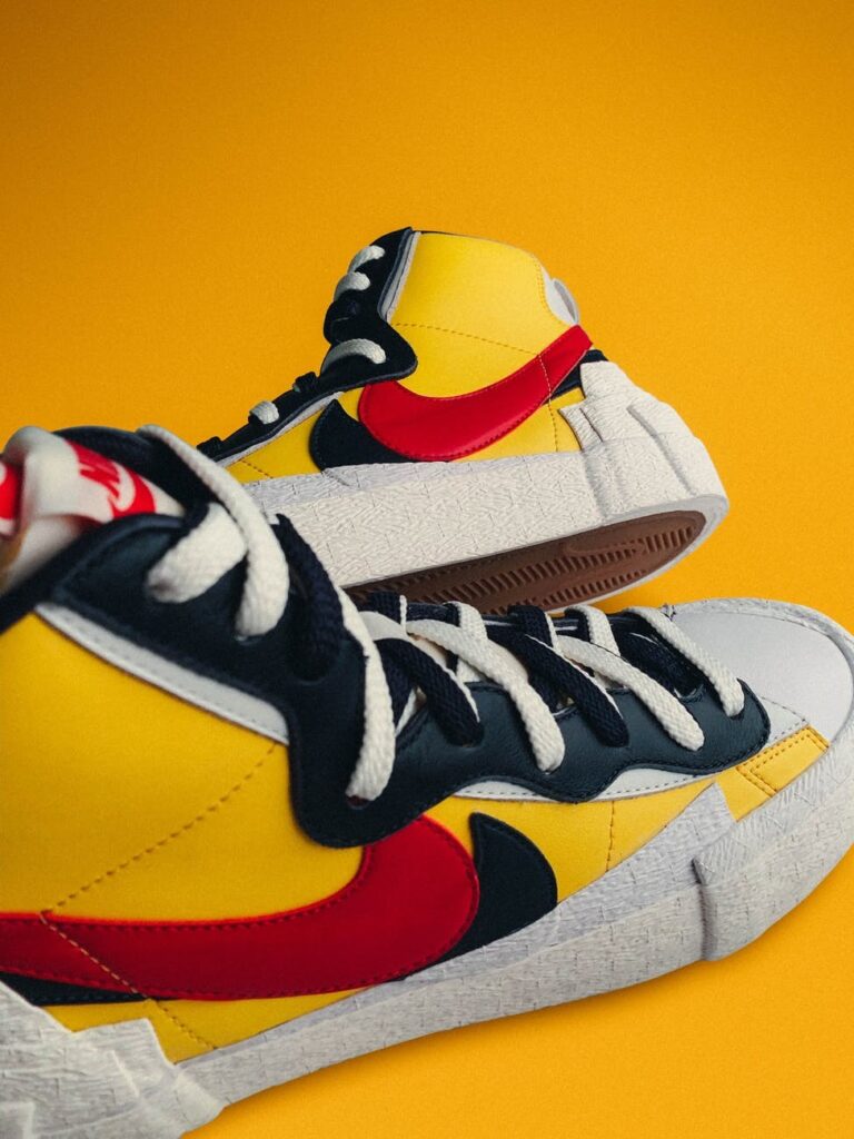
Most designers use these combinations successfully. For example, in the left image below, an overall warm colour scheme has been chosen. This gives the image copy a soft and welcoming vibe.
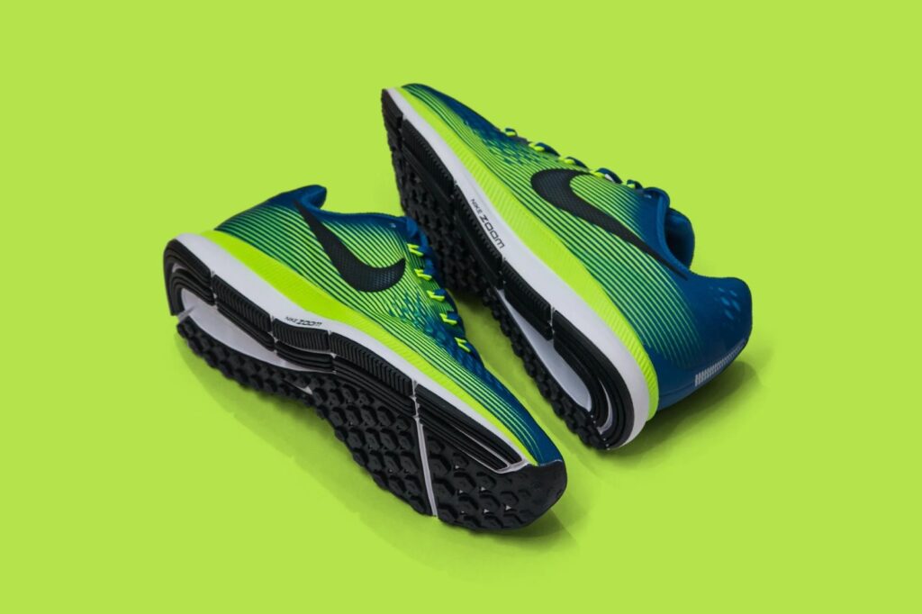
Whereas the right image uses a green and earthly vibe. This is used in combination with blue which is an Analogous scheme.
Font Matters
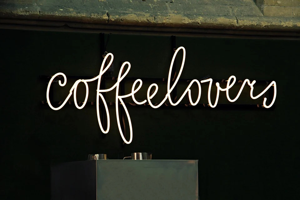
Font plays an important role in establishing the tone of your company. A funky design like “Jokerman” can establish a vibe that is cool and welcoming. Whereas fonts like “Calibri” or “Roboto” can let users know that your company has a much more serious and to-the-point atmosphere.
Which one of these gives off a serious vibe to you?
Designing Ads For Popular Platforms
All platforms have their strengths and weaknesses and it is up to you to take advantage of this. Here are some specific tips for each platform. A single ad cannot perform well across all media. So make sure to take time out and curate it for different platforms.
For Facebook
- Facebook allows targeted ads. So, create multiple copies to display to different user demographics. For example – you can create one copy for younger users with pop-culture references, and one for older users with other references.
- Facebook has introduced Canvas Ads. This allows you to create rich ads full of images, text, videos and flashy animations. 53% of people who open these ads watch it to completion. Make use of this medium to create special Canvas Ads. You can use Venngage for this.
- Right-side ads on Facebook are quite small. So make sure you use a visual with minimal text.
- For sponsored ads in between posts, make sure you include a CTA button.
- 75% of Facebook users are women. Make use of demographic data to target ads to the right population.
For Instagram
- Recently, Instagram added a zoom feature to their photos. You can use this to hide goodies in your ads. Create tasks around this feature to engage customers.
- Instagram works best with a square template. You can also make use of the grid-like home page structure to break your ads.
- Invest in short videos for Instagram reels. Make sure it is within 8 seconds, even though the time allowed by Instagram is 15 seconds.
- Instagram allows quick video loading. So you can include animated photos.
- Use Instagram stories and highlights to separate your campaigns and keep them relevant for a long time.
For LinkedIn
- LinkedIn users are more inclined towards text than Instagram or Facebook users. So strong headlines are everything.
- LinkedIn has a blue colored interface. What color do you think would stand out against it? Using the color wheel, the answer would be orange or red.
- LinkedIn allows Sponsored InMail with which you can directly send the ads to the mail of targeted people.
- Use Spotlight ads in between posts, and Single image ads with unique and attractive images.
- Keep a lookout for the latest trends on LinkedIn and include such references in your text.
For YouTube
- You can advertise on YouTube in two ways – by a skippable ad before a video, or by asking a Youtuber or Influencer to display your ad in the middle of their video. The second one is more expensive and also likely to have better results.
- Your YouTube ad does not necessarily have to be a video. It can be a series of images designed on Snappa.
- YouTube ads have a landscape ratio. Make sure you keep your text in the center so it does not get covered by the control buttons.
- Have a CTA button that is more prominent than the “Skip Ad” button.
- User skip ads after 5 seconds. Hence, make sure you can grab their attention within that time span.
Conclusion
A good ad copy must be attractive, legible and recognizable. Bank on popular trends and memes. Most companies today rely on taking advantage of upcoming events and news. So use the right tools and the right platforms!
You might find that the features offered by specific tools suit your business. All designers under some trial and error to find their perfect style and tool. Hence, investing some time is essential. If you are working as a one-man team, then BeFunky’s no-share option will not deter you It does have the cheapest pricing plan.
However, if you are looking to allow video ads, Venngage would be a great choice. Canva no doubt remains a top-contender, however, the plan prices can deter SMBs. If you are totally new at this, then the Snappa free trial should be a good introduction to the world of graphic design! The analytics they provide can also be helpful as you won’t need to invest separately in Ahrefs.
We hope this was useful in teaching you the basics of creating a good ad design!