The bright, multicolored Google logo is well-known by 5.5 billion users on the planet. There’s not a single doubt that it’s the most well-known visual brand identity in the world. But not many of them are aware of the journey the logo made since its inception in 1996.
Simple yet bright and unmissable, the Google search logo is a dynamic one that changes to celebrate major occasions/festivities (Google Doodles). Of course, you haven’t missed how the logo undergoes modifications to celebrate events, like Christmas, Easter holidays, or the birthday of some renowned person.
It also changes during major events around the globe to stay significant. Further, when you click on the dynamic logo, it takes you to a search result that shows what occasion it’s referring to.
Isn’t that amazing?
Well, there are several other things to learn about this spectacular logo. And we’re here to tell you all about it.
A Brief History of the Google Logo
In the initial days, when the brand was a mere search engine project at Stanford, it was named Backrub by its founders, Larry Page and Sergey Brin. The reason for this queer name was the purpose of the project, i.e., to find and look for a website’s backlinks. In 1997, they changed the name to Google (thankfully), which was derived from the word – Googol, simply meaning – in large quantities.
Coming back, the first logo of Backrub had Google’s multicolored dynamics, as you can see below:
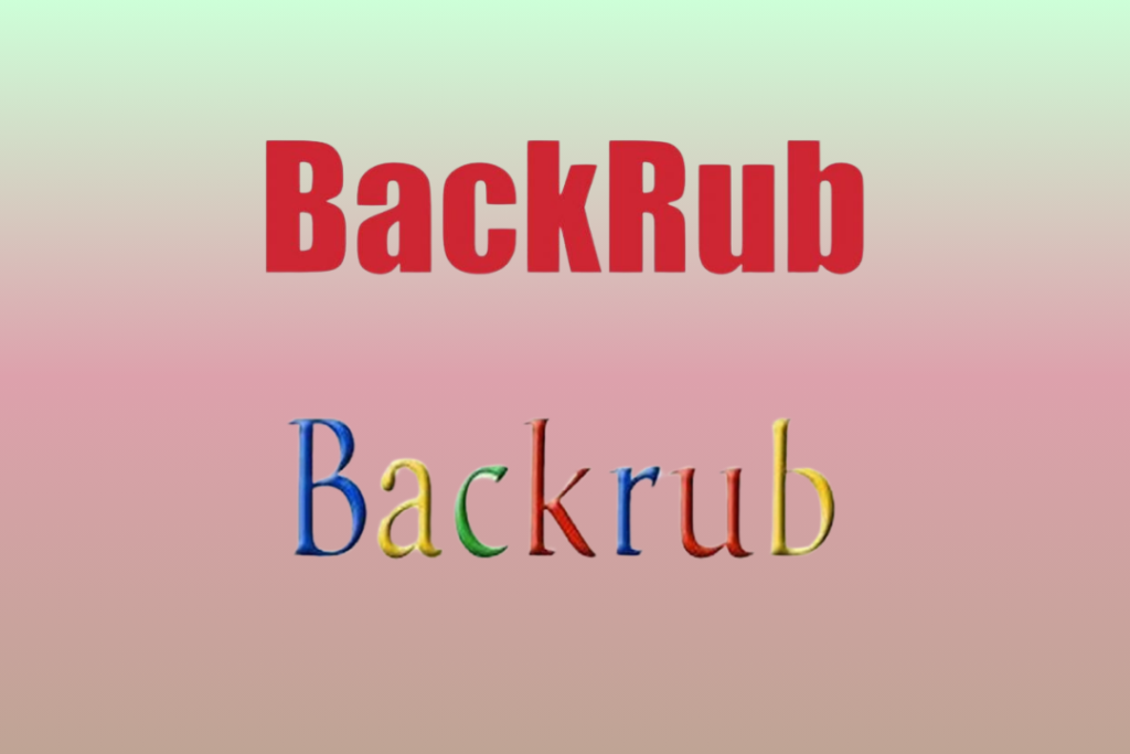
It was only in 1998 that the first Google logo was launched. It was a bright and simple multicolored wordmark logo that could be identified easily.
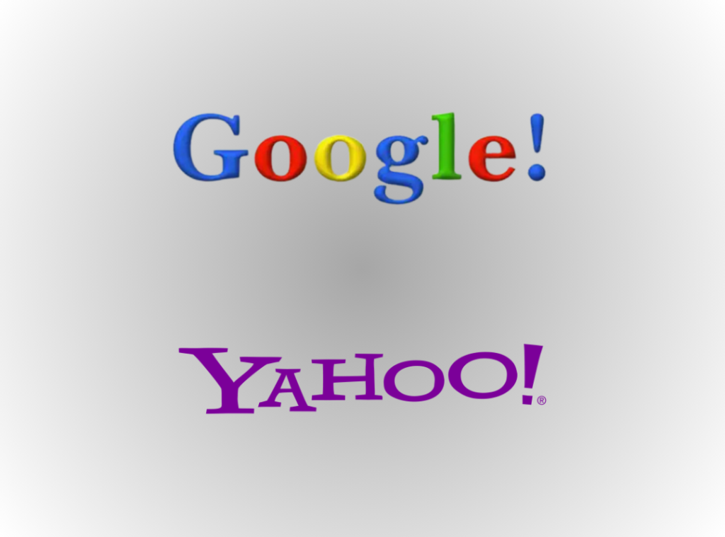
It’s unclear whether it was Larry Page or Brin, who designed the logo, but it allegedly had an exclamation mark at the end, just how the Yahoo logo did. At that time, brands followed each other’s campaigns, so it wasn’t a big deal in those days.
Evolution of the Google Logo
According to many design experts, the first Google logo wasn’t that concrete, or even polished enough to represent the iconic brand. Well, Google wasn’t that famous yet, so it kind of explains why the logo was so bland. It flaunted an authoritative Serif typeface and was kinda “cute” as per the initial Google audience.
This ‘cute’ logo went through some impressive design modifications to become the iconic wordmark logo of today. Let’s scroll on!
First Official Google Logo (1999 – 2010)
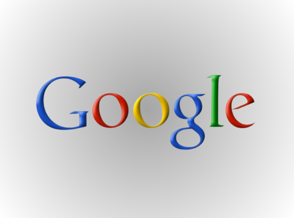
Throughout the most-dominant decade, also known as the ‘classic Google era’, the search engine had a single logo, professionally designed by Ruth Kedar, a graphic designer. The typeface was changed from Serif to Catull, which was sharper and more stylish.
“I looked at a lot of different fonts and I went both Serif and Sans Serif. I was trying to find something that was both traditionally tied to the beautiful fonts in the past and also had a very current and in some ways surprising ways. When I came upon the font, Catull, I really loved the way that it had these very elegant stems and ascenders and descenders and also had these Serifs that were very, very precise and I wanted something that when you looked at it, it was very clear that it’s something you haven’t seen before.” – Ruth Kedar
All the letters were colored with primary shades, except the ‘L’, which had a secondary one, a slightly darker shade of green. According to Kedar, the subtle change in the color depicted that Google didn’t go by the rules.
There were also some other playful changes made by Kedar. For example, the two ‘o’s were slightly tilted to the left, while the ‘e’ to the right. It represented the brand’s youthful spirit and innovative quality. The bright colors are a staple of the brand that has maintained its frisk and fun quality for almost 30 years now.
You need to note something here. The official logo that we saw on the internet wasn’t just a single-step design. Kedar made several designs (about 8) before reaching the final version.
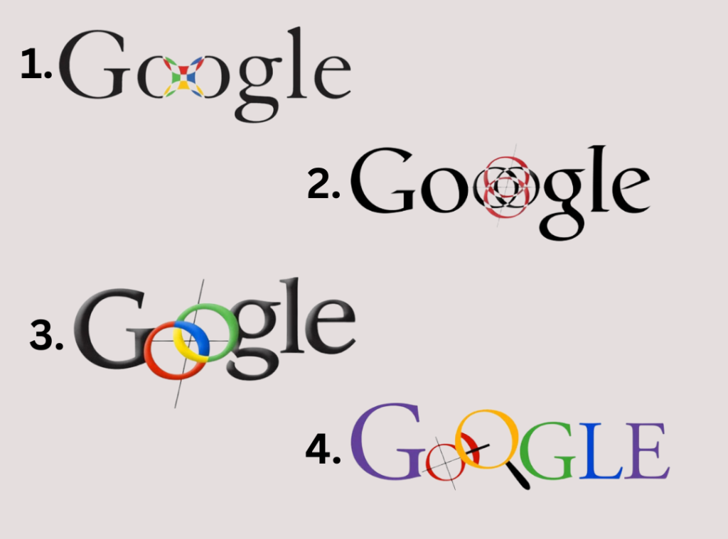
- The first one was an all-black logo with a peculiar mark between the two ‘o’s that somewhat resembled a Chinese finger trap. She used the Adobe Garamond typeface for this logo. Kedar also removed the exclamation sign at the end.
- The next design was made using the ‘Catull’ typeface but was still black. The ‘finger trap’ element was replaced by something that looked like a target, depicting accuracy of the search engine.
- In the third version of the logo, the ‘o’s were interlocked and made colorful. The remaining letters were kept black.
- The fourth design appeared a little more visually overwhelming, according to Page and Brin. It was bright and colorful, with a magnifying glass placed over the interlocking ‘o’s. The shades of the remaining letters were also changed from back to purple, green and blue.
From the fifth to the final designs, the logo started getting simpler and more visually appealing. At first the magnifying glass was merged into the design playfully, with its frame forming the second ‘o’ in ‘Google’. A cute ‘smile’ was also incorporated into the frame.
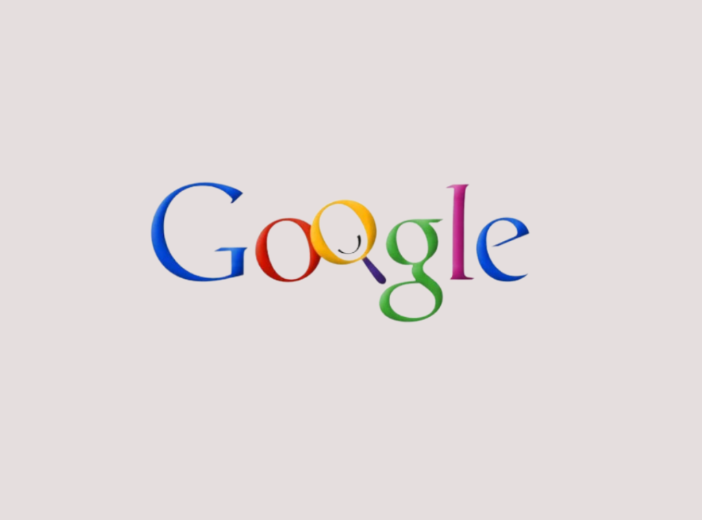
In the next design, the Letters were made bolder with highlighted with shadowing. The magnifying glass was dropped entirely, as Kedar wanted to ascertain that people wouldn’t see the brand as just a search engine. The ‘o’s were also returned to their previous horizontal position.
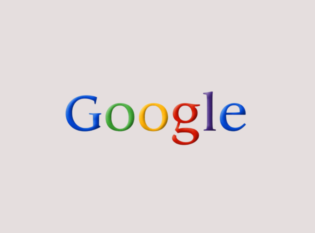
But it still wasn’t the final design yet. Kedar again changed the angling of the second ‘o’, as if it was against the rules. She wanted to depict the frisky and nontraditional nature of the brand through this design. Lastly, besides the ‘o’, the ‘e’ of Google was also slightly tilted to the right.
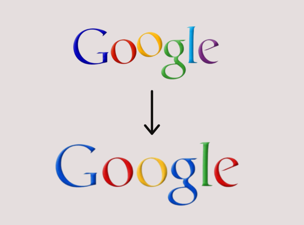
However, she changed her mind in the final design of the Google logo, which became the iconic visual identity of the world’s leading search engine for more than a decade. It was the most minimalist wordmark design that had all the letters in sync with shadowing at the background.
2010 – 2013
By this time, the success of Google had hit high with 25,000 employees, and people from 100+ countries using the search engine. The brand needed a logo that would be in sync with this massive success. As a result, the shadows were dropped from the letters, making them appear sleeker and more intense. The color of the second ‘o’ was changed to orange from the initial yellow. The colors of the rest of all the letters were dimmed a little, creating a somewhat matte finish.
2015 – Present
It was this year that Google designers from all over the world met in the New York City for a week-long discussion regarding changes in the logo and branding. Of course, it was necessary for the world-famous search engine that garnered a revenue of $181 billion that year.
After the discussion, the Google logo changed drastically. While the designers retained the blue-red-orange-blue-green-red palette, the typeface was changed from Catull (Serif) to a simpler Product Sans (Sans Serif). The latter was a more versatile font that could be adapted to any size or form. By then, Google has several product lines that were still growing, and this adaptable font was necessary to cater to the need of the hour.
In other words, the logo was supposed to appear cooler and more youthful, and the designers did a pretty good job at it. It also had other variations meant for the different products of Google, e.g., the smartphone app, voice search icon, Google Chrome, etc.
Google – A dynamic logo
Now, what is a dynamic logo? It’s a design that can adapt itself to changing scenarios and contexts. These are movable logos, somewhat fluid in nature and can take any form or shape without losing the main pattern.
The Google logo, unarguably, is a dynamic one and has multiple variations of the original, static logo today.
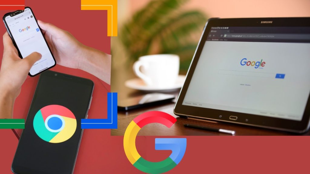
For example, you’ll notice that in voice search, when you’re speaking into the app, three dots, colored in the basic palette of the original logo, keep moving until you have finished. It’s a quality of a dynamic logo, and although the movement may seem random, it follows a definite pattern.
All About Google Doodles
Google Doodles are the perfect example of the logo’s remarkable and intelligent dynamics. It was in 1998 that the brand started experimenting with ‘Doodles’ to break the monotony of its static logo. So the first Google Doodle was introduced in 1998 as a stick figure emerging from behind the second ‘o’ of ‘Google’.
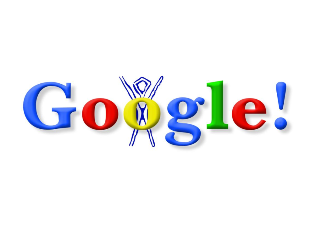
It was during the “Burning Man” festival, a dessert event in the western US, that both Page and Brin attended. Just out of playfulness, they drew the stick man on the Google logo, which ultimately became the first Google Doodle.
In the following years, users saw several Google Doodles on various occasions, like Bastille Day (2000), Halloween, Valentine’s Day, Christmas, and so on.
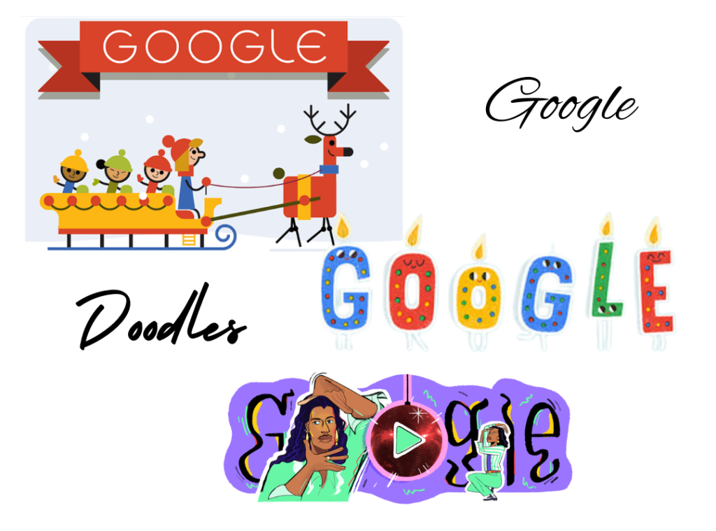
The Doodling was also extended to cover key festivals of other countries, e.g. Holi (India). In 2015, the search engine giant revealed that it has created more than 2,000 doodles for its homepages in multiple countries. By the next year, this number climbed to 4,000.
Google also used its Twitter (now X) handle to promote its Doodling activities, asking people to mail ideas for new doodles at proposals@google.com.
As the brand expands and diversifies its creative demeanour, we can expect more changes in their logo and branding in the years to come.
Features of the Google Logo (Font, Color, and Design Elements)
We all have wondered about the choice of colors in the Google logo at some time. If the rumors are true, then this peculiar color palette was inspired from the colors of the Lego tower that hosted the search engine’s first server. However, these colors went through both subtle and prominent changes over the years, ultimately creating the design that we see today.
Let’s learn more about the fonts, colors, and elements of the logo design.
| Font | Colors | Design Elements |
In the original logo, Kedar used the Catull font, a Serif typeface, that looked quite elegant and unique. However, the Google logo that we see today features the Product Sans font (a Sans Serif typeface), which is sleeker and simpler, to match the current dynamics. | From day 1, the Google logo has appeared to be bright and colorful, inspired from the multicolored case of the Lego tower that held the first server of the search engine. The logo uses four colors, namely, Blue, Red, Yellow/Orange, and Green. By using secondary colors, Google challenges the theme of the color palette to signify the unconventional nature of the company. The initial logos had brighter hues. These shades were muted in the 2010 version, making the logo appear more professional. | The Google logo is a quintessential wordmark logo with no other element or symbol. However, in some previous versions, certain design elements were seen, like a target between the ‘o’s, or a Chinese finger web. There was also a magnifying glass in two versions of the logo, but it was dropped later from the official one. The Doodles, however, feature creative design elements from time to time to cater to the various occasions they celebrate. |
Popularity and Relevance of the Google Logo
The Google logo is the face of the brand and is recognized in a flash, globally. Over the years, the logo has undergone several changes to cater to the changing dynamics and various product lines of the company. Every time the company took a step ahead in innovation, the logo was changed to represent the same. Every subtle change in font or color marked the company’s commitment to technological advancement and innovation, without compromising its brand identity.
And the audience loved those changes too, except once. The 2015 Google logo faced some backlash from the users, who even compared it to a kid’s play-zone title, or fridge magnets. However, with time, they realized that the new logo was more versatile and suitable for all types of devices. Also, the readability score of the new wordmark logo was high across multiple devices.
Fun Facts about the Google Logo
There are several stories around the Google logo, since its official design was launched. Here are some of the facts that have found their way away from the myths.
- The Google logo followed a reverse 3D fashion
In contrary to how we travelled from 2D designs to multidimensional, 3D ones, the Google logo followed a reverse path. The first official logo was a perfectly-rounded 3D design, also highlighted by shadowing the letters. In the latter years, however, the shadows were dropped, and ultimately the 3D design was entirely transformed into the simplistic logo of today.
- The Google logo is end-to-end personalized
Google has always maintained its attitude at being “for the people”, and its logos have been no exception. The Google logo is personalized to the T, be it the G favicon, or the consistency of design elements in all its by-products. The Doodles are also meant to hold on to this personalization concept of the brand.
- The new Google logo weighs only 305 bytes?
The reduction in size from 14,000 bytes to 305 bytes apparently means lesser web space and more savings in terms of money and global bandwidth. However, the hullabaloo about Google reducing the size of its logo is based on partial truth. The new logo is X46 smaller only as an SVG file, as the older one weighed 2.4 KB (SVG). As a PNG file, however, the new logo is much bigger (13.3KB) and only X1.7 smaller than its older version (22.2 KB).
- The first experimental Google logo was made in Microsoft Word
Oh yes! The search engine was at its research stage then. For the sake of the project, the founders created a messy logo that was later eliminated before the brand’s official launch.
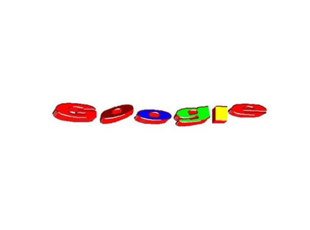
The new design was created Brin on GIMP, a popular editing software then.
- The first Google Doodle was created before the company went official
Yes! The first-ever Google Doodle that depicted a burning stick man was created a week before the company became official in 1998.
5 Things to Learn from the Google Logo
- A logo is more than simply a design. It’s a combination of various elements, like fonts, colors, shapes, symbols, mascots, etc. It’s the face of a brand, something that the audience can remember it with.
- A brand’s logo should be simple yet versatile and expandable to cater to its changing dynamics. For example, the Google logo of today is way different than what it was during the company’s startup phase.
- Minimalist designs appeal to the eye the most. As you can see in the Google logo, it’s just the bare minimum, yet so distinctive.
- Always keep users’ perceptions in mind while designing a brand’s logo. Google has always made changes to its logo based on readability, accessibility and responsiveness.
- Interactive, dynamic logos are the best, and the most acceptable by users. Can you think of anything more fun and interactive than Google Doodles?
Key Takeaways
- Google’s first professional logo was designed by Ruth Kedar, a design professor at Stanford, where Larry Page and Sergey Brin worked on the development project of Google. It underwent several modifications before being finalized in 1999.
- There was an exclamation mark at the end of the letters in ‘Google’ in its first logo design. This was inspired from the logo design of Yahoo! However, the ‘!’ was dropped in the professional version of the design in 1999.
- The Google logo went from 3D to 2D, an unconventional change, by dropping the shadows in 2013 and transforming the rounded letters into a more linear design in 2015.
- The first-ever Google Doodle was the “Burning Stick Man”, which was created even before the company went official.
- The current Google logo is end-to-end personalized and consistent across all the by-products of the company, like Google Drive, Gmail, GPay, etc.
The Google logo is as popular as the brand itself. Because of its inherent simplicity, minimalism, and versatility, its one of the coolest logos in the world. It’s a dynamic design that challenges the norms and stands out impressively.
