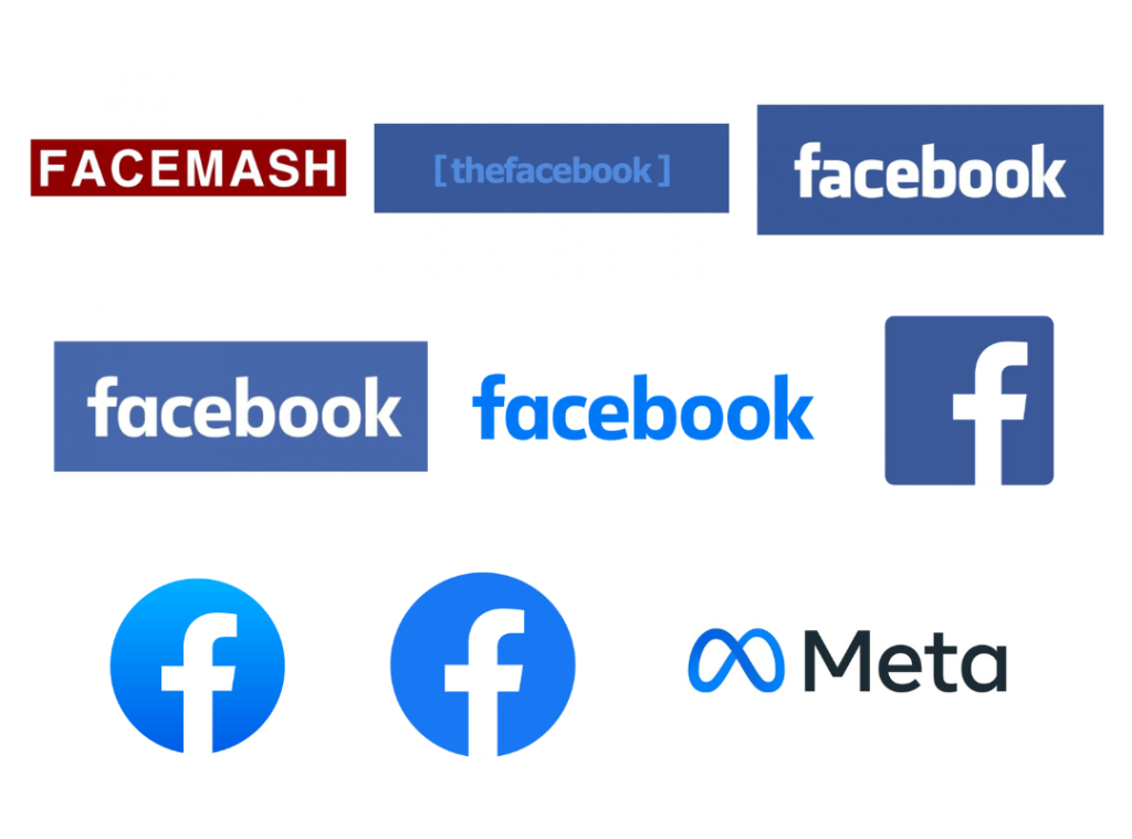
The Facebook logo is one example of how companies should remain consistent and loyal to their brand identities. Now under META, the Facebook logo didn’t undergo any major design change in the two decades of its existence. It retained the blue-and-white hue for all its design modifications, and the typeface didn’t change as well. The consistency in design makes it one of the most readily-recognized logos in the world.
But that’s not all that makes the Facebook logo so unique. The beautiful blue background of the logo has sparked several rumors over the years. According to some reports, Mark Zuckerberg, the brand’s founder and owner, has deuteranopia. It’s a rare kind of color blindness, where the person cannot perceive red-green shades in the color spectrum. Hence, the blue logo!
However, there’s no concrete proof of Zuckerberg’s alleged vision impairment. There are other said reasons for choosing the blue and white color combination of the Facebook logo.
According to design experts, blue depicts knowledge, achievement and motivation, while white signifies purity. Tech companies, thus find this combination quite powerful for their brand identities. For example, LinkedIn is another brand (besides Facebook) that chooses the color combination for its official logo.
Are you in for some more exciting stories about the logo and the brand? Scroll on!
Not Always “Blue”?
So the first-ever Facebook logo was not blue?

Technically, it was ‘Facemash’, the predecessor of Facebook, which had a white typeface on a dark-red background as its logo. Facemash was developed by Mark Zuckerberg in 2003, when he was a student at Harvard. The app was said to be terminated in just two days.
When Zuckerberg launched Facebook in 2004, its logo featured the characteristic blue background with the brand name “the facebook” written on it in light blue.
The visibility quotient of the first Facebook logo, thus, wasn’t too high. A year later, the brand name changed to ‘Facebook’ from ‘The Facebook’. Its logo too became more vivid and iconic, featuring the brand name in white on the blue background.
Who created the Iconic Facebook Logo?
The Facebook logo is a wordmark logo, to be precise. The brand name is itself its identity without any symbol, abstract mark or an image. Hence, the logotype is the most unique feature. It’s a customized one, called the Klavika font, which was created by Eric Olson, and modified by Joe Kral, a professional graphic and type designer. Mike Buzzard, the design manager, led the project.

Buzzard was one of the founding members of Cuban Council, a renowned American design consultation group. He also joined Google in 2012 to further his passion in creating a design-oriented branding approach for the company. It’s said that he refused to receive equity for the Facebook logo when offered the same.
Alleged Meaning of the Facebook Logo
There’s this popular opinion that the letter “f” in the Facebook logo signifies the connection of friends, which the social media network was initially meant for. It was further popularized by the “like” feature, which has now revolutionized the internet world. ‘Liking’ means ‘agreeing’, as we know it today. But Facebook was the first social media platform that created this way of wordless communication with your network.
According to design experts, the logo is beyond just a wordmark. It symbolizes connection, community, and trust – depicted by the unique color theme. It also evokes a sense of purity and happiness, the two pillars of real connections. The blue hue also plays the role of a visual anchor for internet users and creates a sense of familiarity.
Evolution of the Facebook Logo (2005-2025)
A globally-recognized and cherished brand, Facebook has one of the most iconic logos in digital history. The fact that it didn’t undergo too many changes in design over two decades also makes it one of the most consistent brand identities in the world. However, there were changes, of course. The logo evolved into a global icon through these necessary modifications, taking the brand higher up the ladder of digital success.
Only ‘Facebook’ (2005-2015)
Facebook is one of the fewer global brands that has retained a single logo for ten long years. After dropping the ‘the’ from ‘The Facebook’ its logo got simpler – Just the ‘facebook’ logotype in Klavika lowercase against the characteristic blue rectangle. The angled edges gave the logo a certain dynamism. It was, undoubtedly, a classic logo that invariably stood out in competition and embraced by tech lovers worldwide.
2015 – 2019
After a decade, there was a sight modification in the logo design. The holes in the ‘a’ and ‘o’s of the letter ‘facebook’ were made bigger, thus giving the logotype some breathable space. Also the ‘a’ was changed slightly, as you can see in the image. This logo was more readable and catchy, increasing its visibility quotient a tad bit more.
Positive space logo (2019 – 2021)
The first major change in the Facebook logo happened in 2019. The blue background was dropped altogether, and the typeface was made blue. In other words, the logo was transferred from a negative space to a positive one. The blue hue was also made a bit bolder, creating a classic, royal outlook. Lastly, white spaces in the logo were increased to enhance visibility.
A distinct corporate logo was also launched in 2019, featuring the brand name in uppercase and blue.
By then, Facebook was a globally-recognized brand, and it acquired other platforms, like WhatsApp and Instagram. The owners decided that the brand’s corporate identity should be different from its social media identity. Hence, they came up with the corporate logo, which, however, was short-lived.
It was the META logo that replaced this corporate Facebook logo with its characteristic symbol a few years later.
Monogram Logo of Facebook – 2021
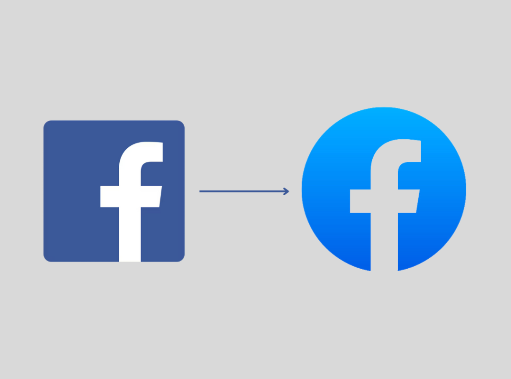
The monogram logo was designed initially for the Facebook mobile app but became a common logo of the brand in 2021. It first featured the letter ‘f’ in white inside a dark blue square. It’s known as one of the most flexible icons in the history of app logos, perfectly catering to the 1:1 dimensions of a smartphone UI. The next version of the monogram icon featured a neutral-shaded, cut out ‘f’ on a bluish gradient circular frame.
2023 – Gradient to Solid Blue
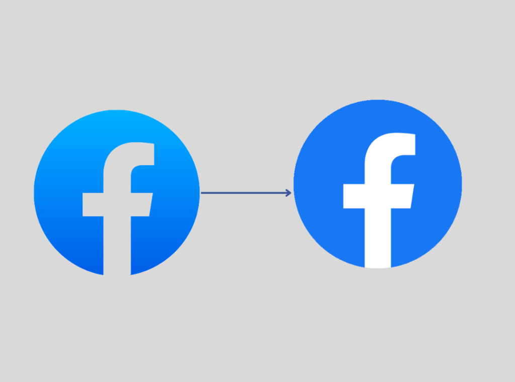
The flat design Facebook logo was released in 2023. It’s not your fault if you can’t perceive the change at first glance. Very few could, in fact. Let’s help you with it.
If you notice carefully, you’ll see that the gradient pattern in the background no longer exists. It’s replaced by a bolder and solid blue shade. Also, the neutral ‘f’ has become a white one.
Now do you get it? Well, this flat design appeared cleaner and refreshing to most users. According to some, it was a trend among popular tech brands, e.g., Google, to adopt clutter-free flat designs for their respective logos.
It’s the same logo that’s in use currently, and if the history of Facebook logo is to be believed, it’s here for a long long time.
META – The Umbrella Company Logo (2021)
By 2021, Facebook founder and owner, Mark Zuckerberg has acquired multiple digital platforms, like WhatsApp, Messenger, Instagram, and also a VR (Virtual Reality) brand, Oculus. The acquisition of all these platforms required a major rebranding. Thus was born the Facebook Metaverse, or simply, META – the umbrella company that owns key social media and digital platforms today.
With the introduction of the new umbrella brand, the company also needed a fresh new visual identity. The META logo was released in 2021 and is currently used by all the acquired brands, in their respective color themes.
The logo of META consists of a stylized ‘infinity’, a loop-like symbol in blue, and the brand name in black. The wordmark, ‘META’, is in a traditional Sans-Serif typeface. Zuckerberg retained the traditional blue of the Facebook logo, while the black typeface denotes authenticity, power, and elegance.
The queer symbol of META
The logo of META has a queer symbol that appears to be a ribbon, shaped like a bow. However, it’s also said that the symbol is derived from the ‘infinity’ sign, signifying the infinite opportunities in the world of technology. According to some experts, it also denotes the digit ‘8’, rotated horizontally. In simple words, the Meta symbol stands for endless opportunities in the digital space.
Facebook Lite Icon – Reversed Color Theme
The ‘Facebook Lite’ is a lighter (as the name implies) version of the Facebook app that uses less data and takes up less space in your phone storage. Its logo is the same as Facebook (now META), the only difference being in the reversed color scheme. The Facebook Lite logo comprises the letter ‘f’ in blue against a white background.
The app runs faster and is compatible with older versions of Android smartphones. It’s also said to be more efficient than the traditional app in areas with low network connectivity.
Concept of the Facebook Logo (Fonts, Color, Design Elements)
The primary expression of the Facebook logo has always been blue. The brand has remained loyal to its identity over the two decades with little changes in the basic logo design. However, there have been some variations in the primary shade, depending on the needs of the hour.
| Font | Color | Symbol |
| The iconic, decade-long Facebook logo was written in customized Klavika typeface. The current one flaunts a simpler, traditional Sans-Serif ‘f’. | The primary color has always been a charming shade of blue. While the earliest logo featured a lighter shade of blue, the current one uses a bolder hue. | The Facebook logo is a wordmark logo, and its brand name is the only symbol it used until 2021, when the brand adopted a new identity – META. The META logo now uses an infinity symbol, stylized to denote the letter ‘M’ in a bold blue hue. |
Role of The Logo in Facebook’s Branding
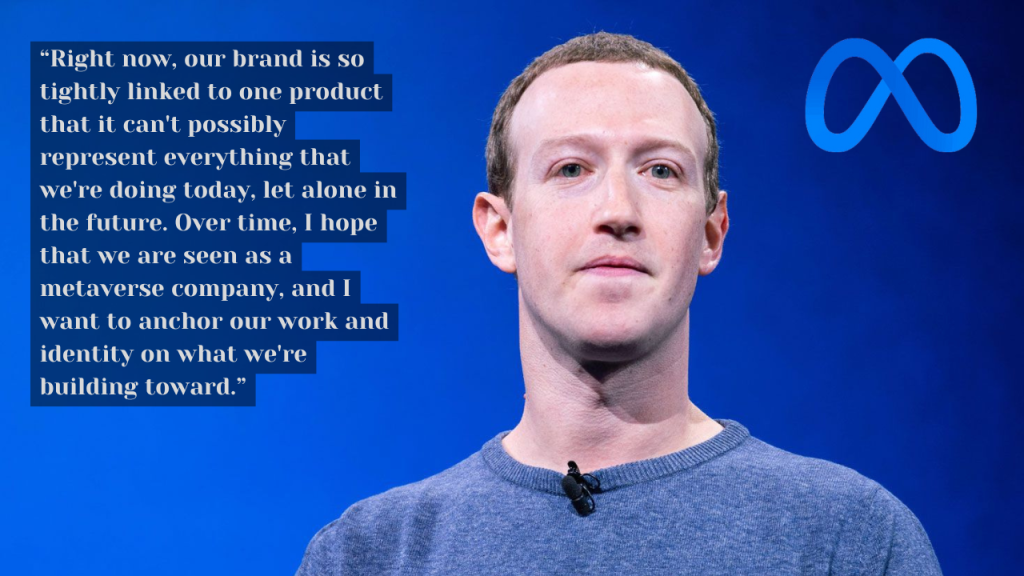
The logo of Facebook (now META) has played a vital role in its branding. Today, it’s one of the classic examples of simple yet effective, impacting and long-lasting logo designs. It’s a globally-recognized logo viewed by nearly 31 million people every day. Today, the logo unarguably stands as a face for the brand and is immediately recognized by digital-savvy users all over the globe.
A Few Exciting Observations about the Facebook Logo
1. The brand has remained consistent with its color scheme – blue and white – over two decades. Like literally! The design changes that the Facebook logo went through over the years were limited to fonts, white spaces, shape of the background, and some subtle changes in gradient.
2. The color, white, universally stands for purity, while blue signifies loyalty and calm. When combined together, the color palette of the Facebook logo gives out a sense of trustworthiness. This caters to the theme of Facebook – to create a safe zone where people can connect and communicate without any hindrance.
3. The logo seems to have a glossy sheen, if you notice carefully. In the design world, gloss denotes class. No wonder this particular detail-oriented logo design inevitably turns out to be the one of the classiest in the world!
4. Using lowercase letters in the logotype was a conscious choice by the designers. Facebook, as a company, always had a relaxing and somewhat informal setting. The brand wanted to depict this sense of coziness through its logo.
5. The current Facebook Messenger logo is a tad bit different than the official logo of the brand. It features a lightning bolt symbol against a blue-and-purple gradient. However, the initial logo of the app was also all in blue, catering to the official color scheme.
Effective Logo Design Lessons from the Facebook Logo
There are tons of things that you can learn from the iconic Facebook logo. Logo design experts have always found the logo classy, elegant and impacting at the same time.
Here are a few effective lessons that the logo of Facebook can teach you about brand identity:
- A single letter can be powerful – Like all wordmark logos, the logotype is the central element in the design. In the case of Facebook, the letter ‘f’ always had major emphasis. It allegedly enhanced the brand’s mission of connecting people and focusing on trustworthy ‘f’riendships’. The letter ‘f’ was later chosen as the key symbol in the brand’s visual identity.
- Colors play a pivotal role in design – We all have heard that in branding, colors play a major role. Facebook has established this fact through its simple yet unique color theme of blue and white. It has maintained the same over two decades, thus teaching us the significance of colors in branding.
- Minimalist is classy – Instead of cluttering the logo with multiple abstract symbols and fonts, Facebook always retained its simplistic, minimalist design, creating a lasting impact on the users. Its choice of design elements also makes the logo one of the classiest in the digital landscape.
- Consistency is the key to building a global brand recognition – The Facebook logo has undergone minimal changes in the 21 years of its existence. It has also retained its theme across all platforms, making the logo an iconic one in the current digital generation.
- Adaptability across multiple platforms – The logo is 100% adaptable, irrespective of the platform it’s viewed on. You can recognize it instantly on all devices without any difficulty. That’s another feature of the Facebook logo that makes it stand out.
Key Takeaways
- The iconic blue hue of the Facebook logo is allegedly attributed to Mark Zuckerberg’s vision impairment, a rare condition that doesn’t allow you to detect certain shades, like red and green.
- The color blue also signifies trust, a major quality of the social media giant that wanted to give its users a safe platform to connect and communicate.
- The Facebook logotype was created by Joe Kral, and customized by Eric Olson. Mike Buzzard, a professional design manager, was the leader of the project.
- Over two decades, the logo underwent a few changes in design and kept its main theme intact.
- The Facebook logo is the face of the brand and is one of the classiest examples of wordmark logos.
- The META logo retains the blue theme of the Facebook logo. However, it also includes a ‘infinity symbol that suggests the endless tech opportunities that the brand provides.
- The Facebook Lite logo retains the key element, the iconic ‘f’, only reversing the color theme. Unlike the official logo, the letter ‘f’ features a blue hue against a white background.
Over to You
Do you think that the designers of the Facebook logo foresaw the immense impact the icon will have on the global audience? Perhaps! Otherwise, why would they come up with such a simple design? The logo of the social media giant ticks all the boxes of an ideal brand logo with its consistent color theme, unique font, and 100% adaptability. Even the modifications that it went through didn’t result in any major transformation. The only key change witnessed is during the rebranding phase, when Facebook was renamed META to comprise all the tech companies it acquired over the years.
If you want to create such an impacting and lasting impression on your audience, focus on minimalism, uniqueness, and simplicity. After all, ‘simple is beautiful’!
