There are brands that need no introduction. Apple Inc. is one of them. The image of the slightly-bitten apple that forms its brand identity (logo) is recognized all over the globe. It’s probably the only “apple” that became so famous after Eve’s forbidden apple.
But why an apple?
There are theories, of course. Some say that the “apple” was inspired by the Biblical reference of “The Forbidden Fruit”. Others opine that it was a tribute to Alan Turing, one of the pioneers of modern computers. Sadly, he took his life by biting a poisoned apple.
However, Steve Jobs, one of the three founders of Apple Inc., rubbished all these rumors and expressed publicly that the brand name and its logo did NOT have ANY hidden meaning or connotation. He just named the company “Apple” because he liked the fruit. That’s it. And the logo too had no background story.
This is quite different from other globally-popular brands, like Nike, Starbucks, Amazon, etc., that always had a story behind choosing their respective emblems.
Let’s learn more queer facts about the Apple logo now.
Apple Logo – Who bit the fruit?
So the Apple logo is a slightly-bitten one, as we all know. But why the bite? Why not choose a whole apple as the emblem of the world-famous tech company?
Rob Janoff, the graphic designer, who created the iconic Apple logo in 1977, suggested the ‘bite’ to prevent confusion with other fruits, like cherry or tomato. The ‘bite’ also allegedly denotes the ‘bite on the Forbidden Fruit’ mentioned in The Bible. It’s said that by ‘biting’ on the fruit of science, you can gain sheer insight into the tech world. Also, ‘bite’ is pronounced as ‘byte’, a digital data unit.
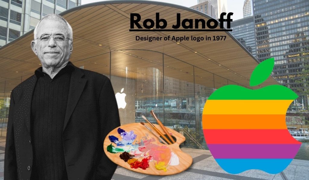
There are more such theories regarding the ‘bitten’ Apple logo. According to designer Rob Janoff, the bite makes the logo appear more vivid and realistic, unlike the bland image of an apple.
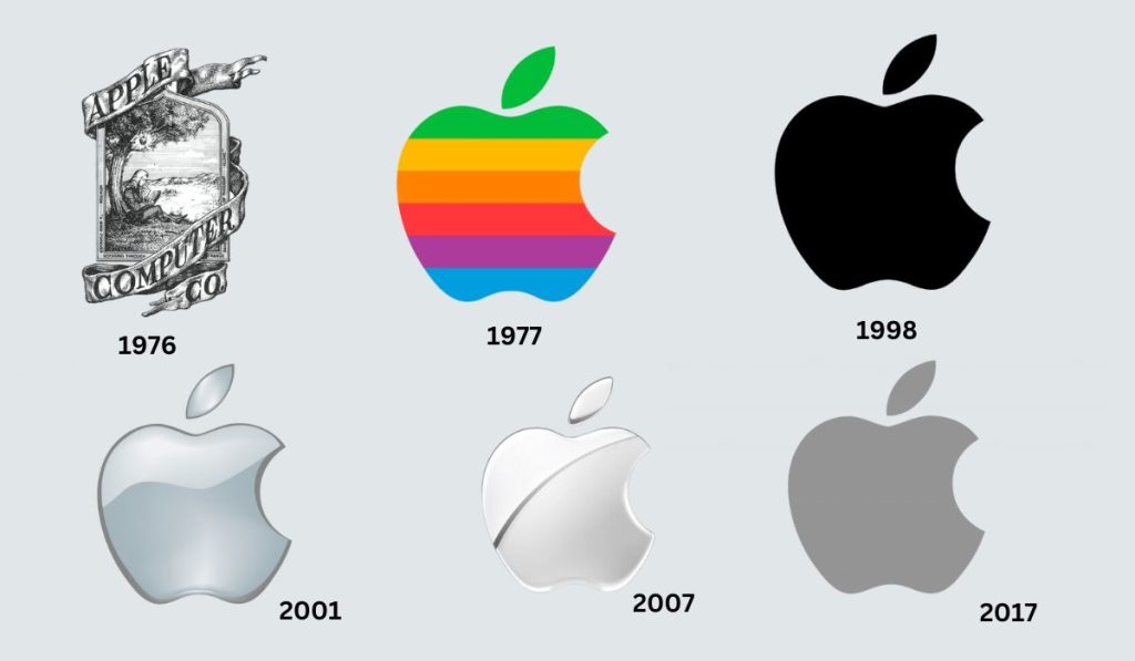
Although the logo went through numerous design variations over the years, the symbol remained the same. However, it’s interesting to note how the rainbow-colored apple became the transparent and classy icon that we see today.
Evolution of the Apple Logo (1976 – 2025)
The Apple logo undoubtedly stands out as a global icon. However, it wasn’t always this glass-themed bitten apple that we see today on iPhones, iPads, etc. Let’s learn more about how the logo evolved in the 48 years of the brand’s existence.
1976 – The Newton Plaque
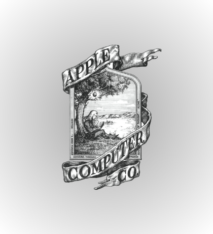
The first-ever logo of Apple was the Newton Plaque, designed by Ronald Wayne, one of the three founders of the company.
It depicted Sir Isaac Newton sitting under an apple tree and reading a book. Symbolically, this Apple logo was meant to recreate the exact moment before the apple fell from the tree and led to the discovery of gravity by Sir Newton. The logo also had the brand name on a ribbon wrapped around the picture, as you can see above.
However, the Newton Plaque failed to represent what the tech company stood for and was quite confusing. Hence, the logo was upgraded the next year, and Apple ultimately got its unique brand identity.
1977 – The Rainbow Apple
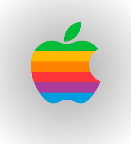
Steve Jobs hired a professional graphic designer, Rob Janoff to rebrand the company’s logo. It was Janoff, who created the first ‘bitten apple’ logo in a spectrum of rainbow colors. Many people assumed that the color spectrum was a homage to the LGBTQ+ community, of which Alan Turing was allegedly a member.
Busting the myths, the rainbow Apple logo actually represented the first-ever PC to support color graphics. Oh yes! Apple II was the world’s first colored-screen computer. Hence, the rainbow spectrum completely justified the company’s brand identity at that time.
The design was a simple one, consisting of a 2D bitten apple in a broad spectrum of rainbow tones, splashed horizontally across it. The brand name was cleverly fitted into the bite.
This beautiful rainbow palette remained a part of Apple’s visual identity till 1998. However, in 1984, the brand name was dropped from the logo, making it simpler and clutter-free.
1998 – The Iconic Black Apple
Do you know that Steve Jobs was allegedly pushed out of Apple in 1984? Well, whatever the truth is, he returned to the company in 1997 and gave its brand identity a complete reboot. Besides other things, he transformed the “rainbow” apple in the logo into a solid “black” one that catered to the newer, sleeker, silver Apple models. It was during this phase that the iMac was developed, and it became one of the first products to flaunt the new logo.
2001 – The Aqua Apple Translucent Logo
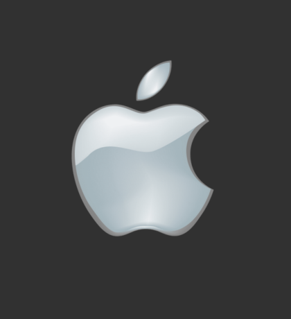
The translucent aqua Apple logo was released in 2001 to be featured on Cheetah, the brand’s new MacOS X model. Other products of Apple Inc., like the iPad, iTunes, etc., also flaunted this beautiful icon that was partly blue and partly silvery in texture. It’s said that the aqua logo was somewhat inspired by the short-lived glass-themed icon that Jobs approved in 1998.
2007 – The Sliced Apple Logo
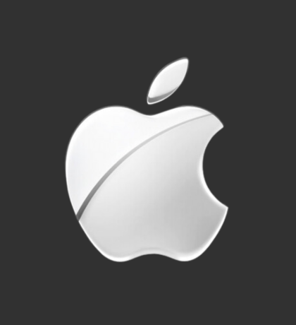
With the release of the first iPhone, the ‘bitten’ Apple logo was sliced in half, as you can see in the image. It gave way to a more streamlined and trendy impression, catering to the new technologies.
The logo was also known as the metallic logo not only because of its visual texture but also the fact that the new products, like the MacBook Pro series all featured custom aluminum enclosure. Apple moved towards a greener future with less carbon footprint, resulting from an energy-efficient architecture. Even today, the company stands its ground on the usage of 100% renewable energies and supports several global energy projects.
2017 – The Flat Logo
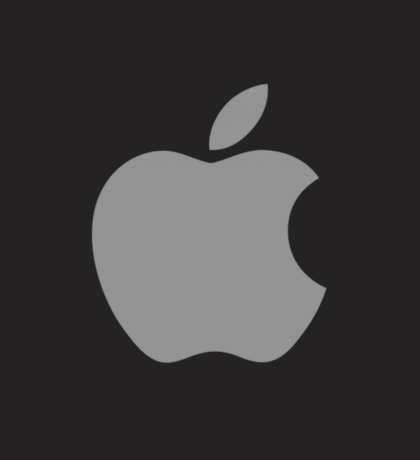
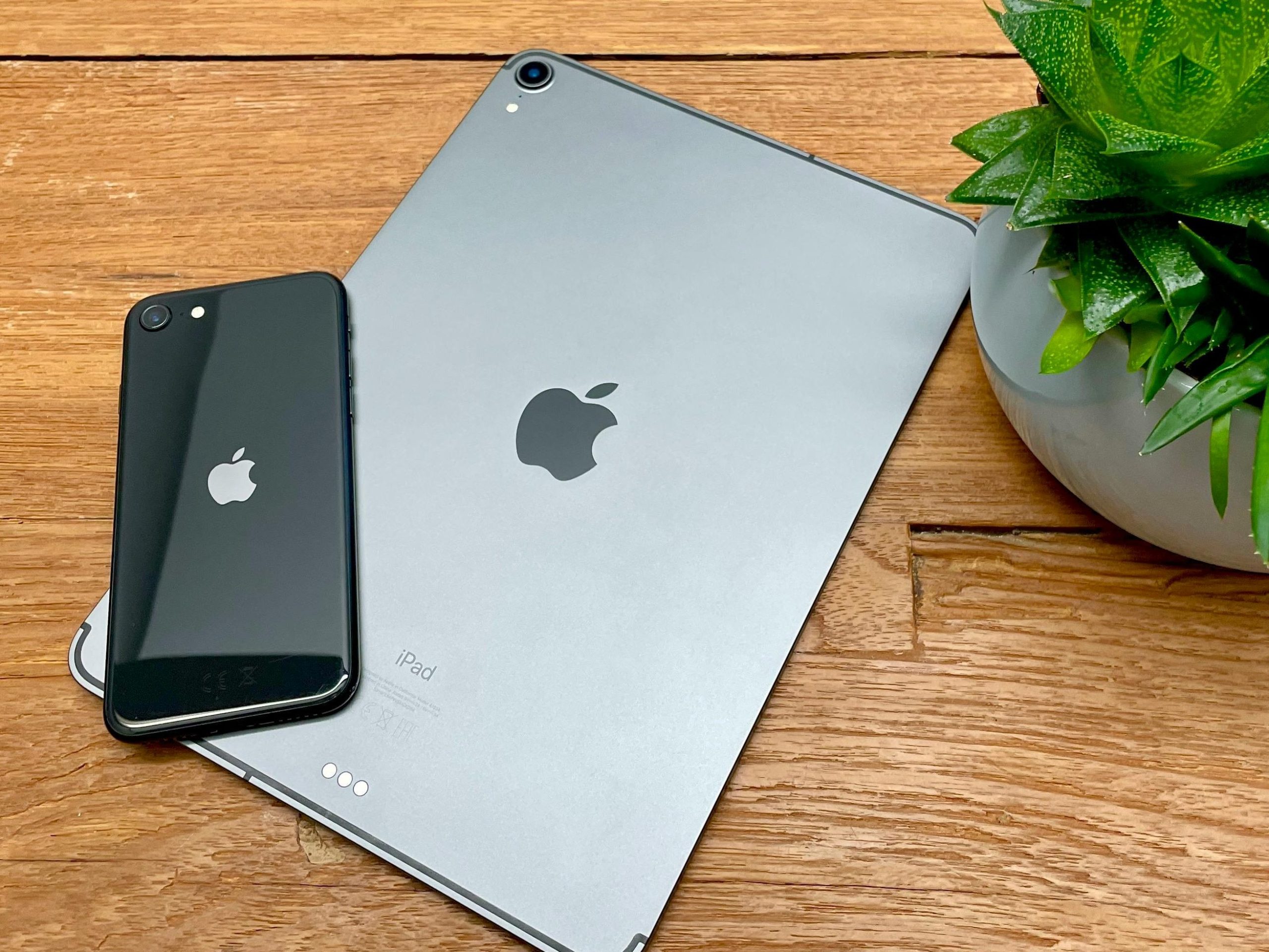
The grayish, flat, monochromatic logo that we see today on almost all Apple Inc. products, like the iPhone, iPad, MacBooks, etc., was designed in 2017. Its reflective properties cater to the diverse range of Apple products, ensuring an elegant yet super-trendy look.
The mid 2010s was a time when all the big brands, like Google, YouTube, etc., were changing their logos to flat designs. Apple wasn’t an exception to the trend. The flat, monochromatic feature of the new logo allows for more readability on any interface, besides exuding a simple and minimalist appeal.
Today, the colors of the Apple logo varies between white, gray, and black, depending on the background. However, the flat, monochromatic theme remains intact, as its simplicity and elegance is recognized globally.
Features of the Apple Logo (Colors, Fonts, and Design Elements)
The Apple Logo is a symbol (or pictorial) logo with an apple as its primary symbol. There are several types of logos with different features and emblems. The logo of Apple Inc. consists of this well-known fruit with a bite on the right side that signifies many things, according to many people in the industry. Some say that it’s the bite of knowledge inspired by Eve biting the ‘forbidden fruit’ in The Holy Bible. Some others assume that the bite denotes Alan Turing’s poisoning.
However, Steve Jobs, one of the founders and the former CEO of Apple Inc, rubbished these rumors in the early 90s once and for all. He stated that the bite was there only to distinguish the apple from cherry and other similar fruits.
Other salient features of the famous Apple Logo has been explained below:
| Colors | Typeface | Design Elements |
| Rainbow spectrum – It denoted the first-ever computer that supported multicolored graphics. Black – The Black Apple logo was designed to create a stronger and lasting visual impression. Silvery/Gray/White – These are neutral tones that create a sleek, trendy impact and also cater to the metallic interfaces of most Apple devices. | The logo itself doesn’t have any wordmark. However, there are instances, like packaging and marketing, when the brand name is used along with the Apple Logo. The most-common typefaces for the brand name are San Francisco or Myriad, both being Sans-Serif fonts. | The bite mark is the only characteristic design element of the Apple logo. It’s placed at the right side of the apple, thus distinguishing it from a cherry, or a tomato. |
Relevance and Popularity of the Apple Logo
According to netizens worldwide, Apple is one of those brands that have the most memorable logos. It’s because the logo aligns perfectly with the brand name and its identity. A 2022 Statista study reports that in the industry of wearable devices, Apple’s brand awareness stands at 92%.
On a global scale, Apple is in the list of top five brands with an instantly-recognizable logo. It won’t be wrong to say that Apple Inc.’s customers are emotionally connected to the brand through its distinct bitten-apple logo. The iconic logo has also inspired millions of futuristic brands to come up with simple yet impacting and lasting identities over the years. Some of these are Volkswagen (automobile manufacturer), FedEx (logistics company), Target (an online shopping store), etc.
Interesting, Lesser-Known Facts about The Apple Logo
- The Apple logo is a tribute to Sir Isaac Newton, the greatest scientist of all time. The first-ever logo of the brand thus featured Sir Newton sitting under an apple tree with a book in his hand. It’s said that it was a moment before he discovered gravity.
- According to graphic designer Rob Janoff, the bite on the apple in the logo was not to differentiate the fruit from cherry or tomato. It was to maintain the visual impact of the logo when printed monochromatically.
- In the 2000s, Apple Inc. made a shift from plastic to aluminum to express its support towards a greener planet. Likewise, the logo was also redesigned to give it a metallic finish. The new logo aligned with the company’s principle to use renewable sources of energy.
- According to many people, the rainbow Apple logo is a secret tribute to Alan Turing, a pioneer in modern computer technologies. He was a member of the LGBTQ community and committed suicide by biting a poisonous apple. The resemblance is quite uncanny, but unfortunately, Rob Janoff, the designer of the Apple logo rejected this theory completely. Also, the rainbow-colored LGBTQ flag was introduced a year after the release of the logo, thus proving that the Turing reference is just a rumor.
- There’s a popular belief that Rob Janoff took about $100,000 to design the Apple logo. However, this is again a myth. The real cost of the logo was only $15, a part of Janoff’s fees for designing the entire brand identity package.
5 Things to Learn from the Apple Logo Design
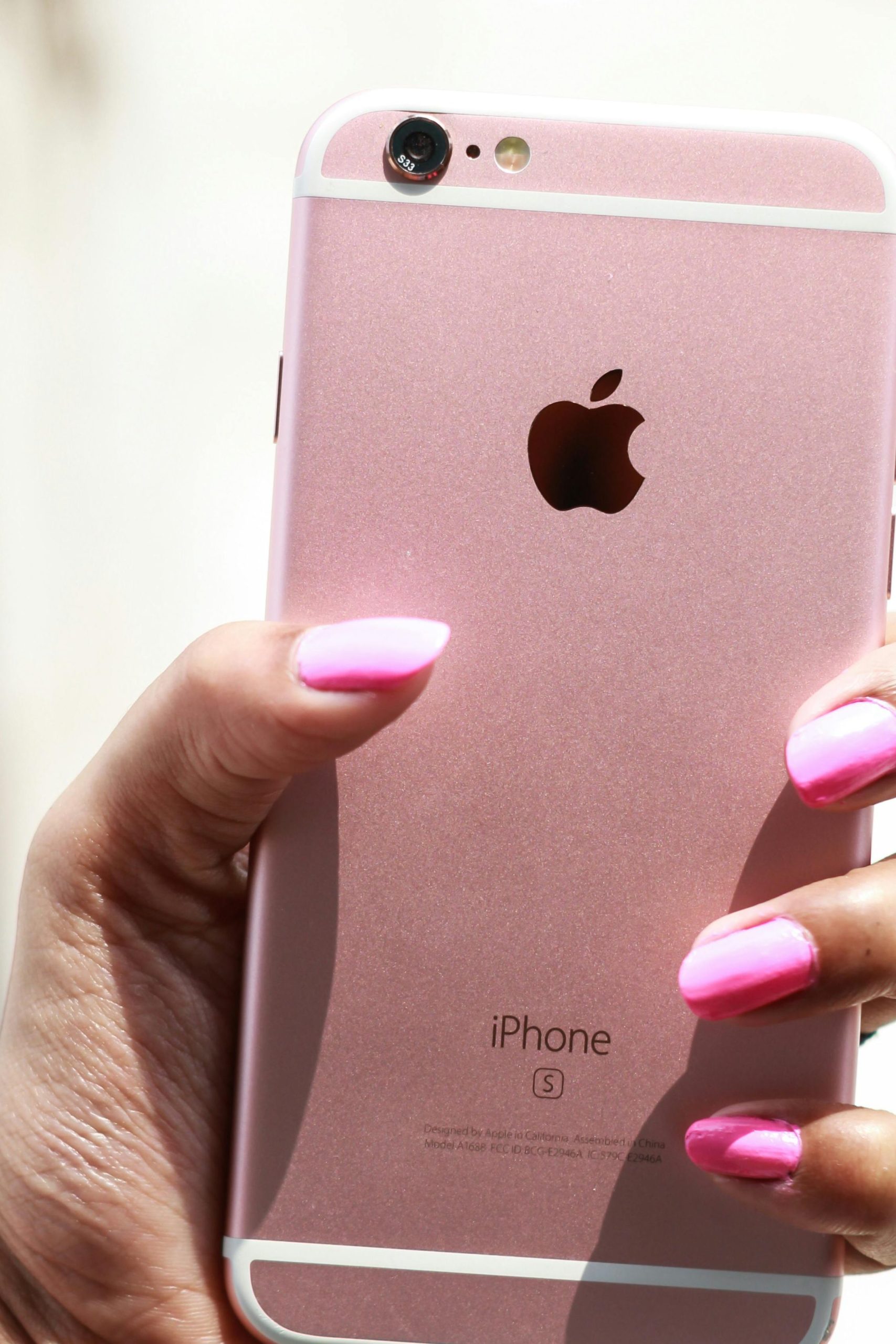
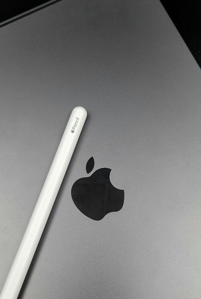
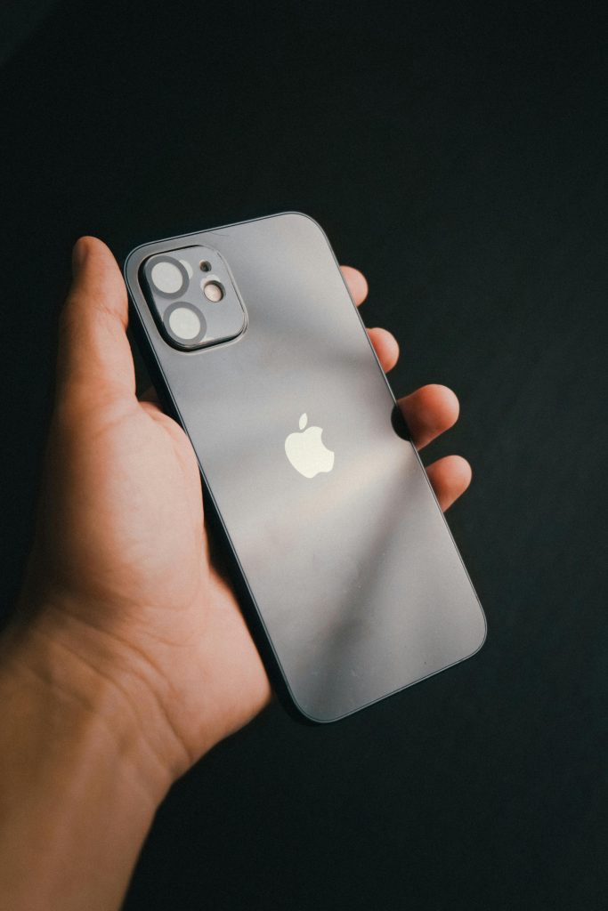
Source : Pexels
- Simplistic designs stand the test of time – Of course, the Apple logo is one of the most simplistic and minimalistic designs that have stood the test of time. Today, it’s one of the few globally-recognized iconic brand logos. Though a minimalist design, the bite on the apple is a distinct feature that helps the logo stand out.
- Relevance is everything – When it comes to creating a strong brand identity, one should always root for relevance between each brand element. For Apple Inc., both the brand name and its logo are relevant to each other, thus ensuring a robust identity.
- Flexibility across diverse devices – The Apple logo is versatile and flexible across a wide range of Apple Inc. products. It doesn’t matter what products the company will produce in the future, the logo will require little or no change to continue exuding its elegant appeal.
- Emotional impact on customers – The Apple logo successfully connects with customers around the globe. Every Apple customer loves the logo, which has its individual value. Today, the logo exudes an essence of sophisticated taste, elegance and aristocracy, besides strengthening the bond between Apple Inc. and its customers.
- Storytelling ability – A logo that tells a story is remembered by everyone. The Apple logo narrates the story of the brand, its inception and remarkable journey, to much delight of its customers. Whenever you see the logo, you remember the brand’s incredible story that has inspired millions throughout the world.
Key Takeaways
- The Apple Logo is an iconic symbol, a pictorial logo that’s stood the test of time for about five decades.
- Inspired by Sir Isaac Newton, the brand identity of Apple is a beautiful story in itself, starting from inception to global success.
- The ‘bite’ on the Apple logo sets it apart from other similar fruits, like cherry.
- The first-ever logo of Apple Inc. featured none other than the greatest scientist, Sir Isaac Newton, and was a tribute to this ‘Eureka’ moment of discovering gravity.
- The rainbow Apple logo was a symbol of the first-ever colored-screen computer, the Apple II.
- The monochromatic logo of Apple Inc. is versatile, classy, elegant and timeless, to say the least.
Wrapping it up
The Apple logo teaches us the power of simplicity and versatility, regarding a brand’s identity. It’s minimalist nature coupled with its distinct ‘bite’ mark is one of the biggest reasons for its global popularity. The logo empowers all designers to be simple yet impacting in their approaches. In the 48 years of its existence, the Apple logo has emphasized simplicity and symbolism, making the brand the celebrated global icon it is today.

